Thursday, January 29, 2015

Form & Space

The Unity of Opposites

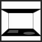
All around us we see different elements that vary in size, shape, color, and orientation. As a team the brain and eyes help organize these elements in our mind into two different groups. First we see positive elements which are the surrounding figures. Also, we recognize the negative elements that provide a background for the figures. As our brain interprets the positive and negative elements, we begin to understand and distinguish the compositions around us. Although positive and negative elements are opposing elements the reality is that they couldn't exist without each other. Together they form the Unity of Opposites.


An example of the unity of opposites in the built environment:


The heavy, dark, black furniture contrasts immensely with the stark white walls and floors. This truly helps us recognize the positive elements from the negative elements. The furniture starts to look less like furniture and more like black spots on a white sheet. 


Horizontal Elements
There are two types of horizontal elements that define space: the base (floor) plane, which may be elevated or depressed, or the overhead (ceiling) plane. When focusing just on horizontal planes within space it is usually implied that vertical boundaries do exist. Usually the horizontal elements help ground and define the organization of the vertical elements.

An example of horizontal elements in the built environment:

Although not necessarily defined by walls the change in flooring material on the base/floor plane of the room helps define the spaces from one another. The curve placed within the materials could suggest a path of movement throughout the space.

Vertical Surfaces:

Vertical forms have a greater appearance with space. They are more important when it comes to defining volume and providing a sense of enclosure. Vertical forms separate one space from another, whether it would be the interior from the exterior or the interior from other part of the interior. In addition to providing enclosure, they also support the floor and roof planes, provide protection from the climate, and control the temperature, air, and noise in a space.
A visual representation of vertical elements in the built environment:

Although surrounded by other planes the red wall acts like a single vertical plane not only through color but also orientation. It helps define the space and emphasizes the space to the front and back of it. Although it is not floor to ceiling it encloses the room with its height.


Openings in Space-Defining Elements:

Continuity between spaces in impossible without openings within the planes of the form. Openings can come in the form of windows, doors, archways, etc. Each provides a different purpose and feeling based on the needs of the space. While these openings are important in order to keep continuity from one space to another, depending on their location, number, and scale they can begin to weaken the enclosure of the space. Not only does the type of opening give a distinct feeling to a space but the location of it does also. The opening might be within the plane, at the corner of a plane, or between planes


A visual representation of openings in the built environment:


In this image we not only see the large scale windows in the corner but also they door to the right. The door acts almost as another window amongst the group however since it is mostly glass. Openings located in the corners of the room tend to give the room diagonal direction towards them. It is most likely the windows in the corner of this room were used to capture the view.


Qualities of Architectural Spaces

Although enclosures and diagrams helps us recognize many of the concepts provided they do not truly capture the real qualities and richness of an architectural space. The properties of enclosure are still very important in determining how we define these qualities of space such as color, texture, pattern, light, etc. We perceive these qualities not only by the properties given by off each and but also by our prior experiences, cultural influences, and personal interests.
Three main qualities discussed and shown below are degree of enclosure, view, and light.


A visual representation of architectural qualities in the built environment:

Here the large view dominates the space and provides a backdrop for bathing. It also helps bring the interior space outward especially with the use of a large scale window. It almost eliminates that feeling of enclosure. In addition the strong amount of natural light has casted dark strong shadows throughout the space defining the forms within it.

Friday, January 23, 2015

Form

Although the word form can take on many meanings, in the context of interior design and architecture we use it to refer to the unity between both the interior structure and exterior outline as a whole. In most cases form involves a three dimensional volume whose appearance is affected by the configuration of shapes. In addition to shape, other visual characteristics of form include size, color, and texture. Forms also have relational properties that impact composition these consist of position, orientation, and visual inertia.

Primary Solids

Primary solids consist of primary shapes that have been altered through extension or rotation in order to make them three-dimensional. For example triangles make pyramids or cones, circles make spheres and cylinders, and so on. Just because the word solid is used doesn't necessarily mean the three dimensional object is a substantial form. It can in many cases be hollow.


An example of a primary solid (pyramid) in the built environment:


The various pyramid roofs help define different wings of this house. It is a sharp design feature due to the steepness of the pyramid along with the repetition amongst the group. As you can see each pyramid roof has what appears to be sky light at the top making it not a completely whole form even though it is still considered a primary solid.

Dimensional Transformation

By changing the physical dimensions of a form you may alter the appearance of the form through dimensional transformation. Although the transformation may in some cases be drastic, the form still remains part of its original primary solid.


An example of dimensional transformation in the built environment:


The columns surrounding  this house have been altered from the basic cube. Although many alterations could be possible, it is likely that an extension of the height changed its physical properties.

Subtractive Form

Other than changing its dimensions, a form can also change in appearance due to the subtraction of part of the form. Although part of the form many be deducted the form can still keep its relative shape if enough of the form is still in tact. In some cases if the change is drastic it might even be transformed into another form.

An example of a subtractive form in the built environment:
The basic form of this modern house could be classified as a rectangular prism. The bottom lower level however has been subtracted in order to make space for an outdoor living area. The forms still stays true to its relative form though. Through subtraction it has basically broken down the form into multiple rectangular prisms.


Additive Form

Even more drastic changes can be made to a solid with the addition of one or more forms in conjunction to the original. The number of additions in combination to their type and size ultimately determines whether the original solid's identity is changed. The type of addition by no means has to match the original solid. Cylinders can be added to pyramids, cubes can be added to spheres, and so on. However, in order to be unified they must be relatable in some fashion. There are many basic groupings of forms and these include: spatial tension, edge-to-edge contact, interlocking volumes, centralized form, linear form, radial form, clustered form, and grid form. Most of these are pretty self explanatory based off their name. The examples below are representations of face to face contact.
An example of additive form in the built environment:
The highlighted area within the picture is an addition to the main part of the house. The two forms make edge to edge contact. The various architectural details help tie the two buildings together.


Formal Collision of Geometry

Forms of two different types of geometry merging together will often fight for visual power. In cases like these forms may work together by suppressing their identities and creating a new form together. Other times the one might entirely encapsulate the other. Additionally, they can both retain their properties and simply share the interlocking part of their forms. Their merge might not even be within each other at times but instead with an element that connects to the geometry of one of the original elements. Often this is done to emphasize a certain part or parts of a building or space.
 
An example of formal collision of geometry in the built environment:


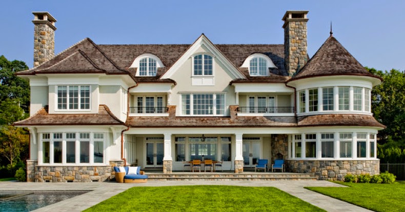
The facade below in addition to containing additive form also has formal collision of geometry. The cylindrical tower on the right breaks up the mostly straight lines and merges slightly with the right side of the house. Both forms still keep their identities.

Tuesday, January 13, 2015

Primary Elements

The primary elements --- point, line, plane, and volume --- are the fundamental building blocks for design. Without these primary elements, Form, Space, and Order ceases to exist. In the same order stated earlier, the primary elements begin to grow from one dimensional to eventually three dimensional. Although these elements may seem a little elementary, it is important to review them to better grasp their importance in design.

POINT

The most basic element, and the beginning of it all, is the point. The point marks a particular location in space. It has no sense of dimension; instead it considered more of a fixed, simplistic element. Even with no sense of form or dimension a point can convey various feelings. When placed in the center of an environment it reads as stable and secure. As the point moves off center it becomes more intrusive and fights for dominance. A point can be used to mark parts of other primary elements such as the intersection of two lines, the ends of a line, the joining of lines in the corner of a volume or a plane, or the center of a field.

Below is an example of point used in the built environment:
Clarity NW Photography. (Photographer). (2014). Woodinville Retreat [Web Photo].
The dark metal elements contrast greatly with the light tones of the rest of the kitchen and bring focus to these various points in the room. It is also known that points can create lines and other elements. If you mentally connect the dots of these points, conceptual lines can be created.

LINE

Line comes to life with the connection of two points or the extension of a point. These methods give the line length but still deprive it of width and depth, making line a one-dimensional object. The motion of the point or points make the line dynamic and directional. Although two points may give the line a fixed length, the segment can really be considered part of a longer line. Lines serve to connect, enclose, and support other visual elements. They also bring life to edges and surfaces of planes. Different types of lines provoke different feelings. Horizontal lines, for example, convey rest and stability while vertical lines are strong and energetic.

Below is an example of line used in the built environment:

Benson, R. (Photographer). (2015). Greenwich Shingle Style [Web Photo].
The continuous use of horizontal lines with the roof line and the rest of the facade helps create a sense of stability and permanence for the house. The many horizontal lines move your eyes outward making the house seem wider and bigger than it actually appears. Each horizontal line adds another layer to the house and facade.


PLANE

Two linear objects are able to visually express a plane, although one line extended in a direction other than its natural path can do the trick also. This means a plane not only consists of length but also width, making it a two dimensional object. The edges of a plane consist of various directional lines and within these lines a surface is created. Planes are an important part to architectural design in that they are the surfaces in which provide shape, color, texture, and size. Multiple adjoining planes define the limits of a volume, a three dimensional space, in which we create our spaces.


Below is an example of planes used in the built environment:

Horst Architects. (Designer). (2013). Caya [Web Photo].
The planes of this house are used to define the overall various cubical forms of the exterior. Each plane has two horizontal and two vertical lines that define it. While the surfaces of these planes are fairly flat and plain, a few provide interest with different textures and colors.


VOLUME

Volume is created once a plane is extended in a direction other than its inherent direction. Volumes can also be created by adjoining together multiple planes. These modifications of the plane make the volume a three dimensional object consisting of length, width, and depth. This gives the element definite form and space. Its form is defined by its shape and the relationship between planes. A volume consists of all three previous primary elements. Although it is now a three dimensional object that doesn't necessarily mean it is a solid, volumes are also in many cases void.


Below is an example of plane used in the built environment:  

Michael Robert Construction. (Designer). (2014). Classic Coastal Colonial Renovation - the Ultimate Island [Web Photo].
The kitchen island consists of various rectangular planes than in turn make it a volume. Not only does it have form as a rectangular prism but it also defines the space within the kitchen. Like the room itself, the kitchen island is a mostly void volume.

Monday, January 5, 2015

Word Association and Reflection

Who do I see myself as, not only a person but also a designer? My personal thoughts of not only myself but also design will impact who I become as a designer.

Here are some words I would use to describe myself:

1. Driven
2. Smart
3. Quick Learner
4. Independent
5. Quiet
6. Creative
7. Different
8. Strong
9. Visionary
10. Contemplative
11. Imaginative
12. Persistent
13. Open-Minded
14. Focused
15. Goal-Oriented
16. Productive
17. Proactive
18. Mature
19. Industrious
20. Skilled
21. Responsible
22. Self-reliant
23. Logical
24. Innovative
25. Curious

Some words might be a little redundant but many could be used to also describe what design means to me.

Here are some more words of what I think design encompasses:
1. Intelligence
2. Practicality
3. Artistry
4. Function
5. Beauty
6. Stimulation
7. Interest
8.  Meaning
9. Purpose
10. Cleanliness
11. Craftsmanship
12. Organization
13. Economy
14. Psychology
15. Character
16. Personality
17. Originality
18. Evolution
19. Materiality
20. Accessibility
21. Adaptability
22. Simplicity
23. Inspiration
24. Fun
25. Expression

One of my goals is to figure out more words I could put in both of these lists. What else is out there that I still don't know... even about myself?

I hope to figure these questions out by setting and accomplishing other goals and future life experiences, such as:
1. Graduating with a Bachelors of Fine Arts and one day pursuing a Master of Fine Arts
2. Either owning my own company or climbing the corporate ladder at a firm I love
3. Living in Europe and traveling the world
4. Saving, restoring, and bringing life back into old buildings
5. Creating some sort of Family

No matter where I am at or what I am doing, interior design, architecture, buildings, etc. will always follow me and be an interest of mine. I can't tell you why I first wanted to be an Interior Designer at the age of 10, I can tell you now why I still love it. I choose Interior Design for the challenge. There is never one right answer, but I will push to find the best answer in my mind. I choose it because it lets me express myself and my abilities, you don't necessarily have to always follow the books. I choose Interior Design because it employs my greatest strength which is visual/spatial thinking. I think that is why over the years I never changed my mind. Nothing I have found since ever attracted my interest and abilities like interior design. I also choose it because even though 10 years have passed, I have never once grown sick of it. My interest continues to develop in Interior Design, unlike some other paths I once followed.

Do I think I am an artist? I don't know. An artist in simplest terms is a person that creates art. It's not the definition of an artist that I am confused about; it's the definition of art. Everyone's definition of art is different. To me art contains mass emotion; it may have a function, but the real purpose is to convey a thought, idea, or emotion. I would consider myself a designer more than an artist. I feel as a designer, I of course have to consider how things look, but I also have to consider their function hand-in-hand. As a designer my goal is to show others how important function is in addition to looks. It is sort of like when people say look at the inside of someone rather than the outside. Looks are important, but they can also be superficial.

Another message I would like my work to reflect is there is potential in everything. Every space has potential. I feel like the past few decades the majority of people have stopped realizing this, especially with older items & structures. Today people just go for what is convenient, new, and cheap. Quite often these things are a complete bore and have no character. Why waste all the good that is already out there?

Through Interior Design and SCAD I hope to better understand the deeper meaning to spaces. What psychological effects do they have on people? What can I do to make people feel better? How is what I am doing effecting people in the long run? As an interior design student I hope months of studying and designing spaces, working with trial and error, can help me find answers not only of the deeper meaning within spaces, but also deeper meanings within myself and design in general.